Many of you who followed my work will know one of my main inspirations and areas of interest has been memorials and stone-carved lettering. (I even wrote a thesis about them for my BA at Central St. Martins). So every so often I will be publishing interesting examples that I photograph on my travels.

The first one is not the sober piece of classical typography that you may imagine but a rather whimsical one of the painter Patrick Caulfield designed by himself. I do have a slight association with him, his studio used to be on the top floor of the building where our studio is located, and I would see him tottering up the stairs, red-faced after a long alcoholic lunch. I loved his work but was too shy to tell him.
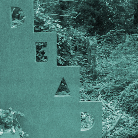
His gravestone is located in Highgate Cemetery, London, very near where I live. A beautiful place to visit, particularly the older, overgrown part. The memorial’s ironic use of Art Deco style typography and the pragmatic announcement ‘DEAD’ never fails to raise a smile to me as I pass by. It shows how a memorial can work to be a reminder that a whole human life is being celebrated – one that is full of achievement but also of humour and irony.