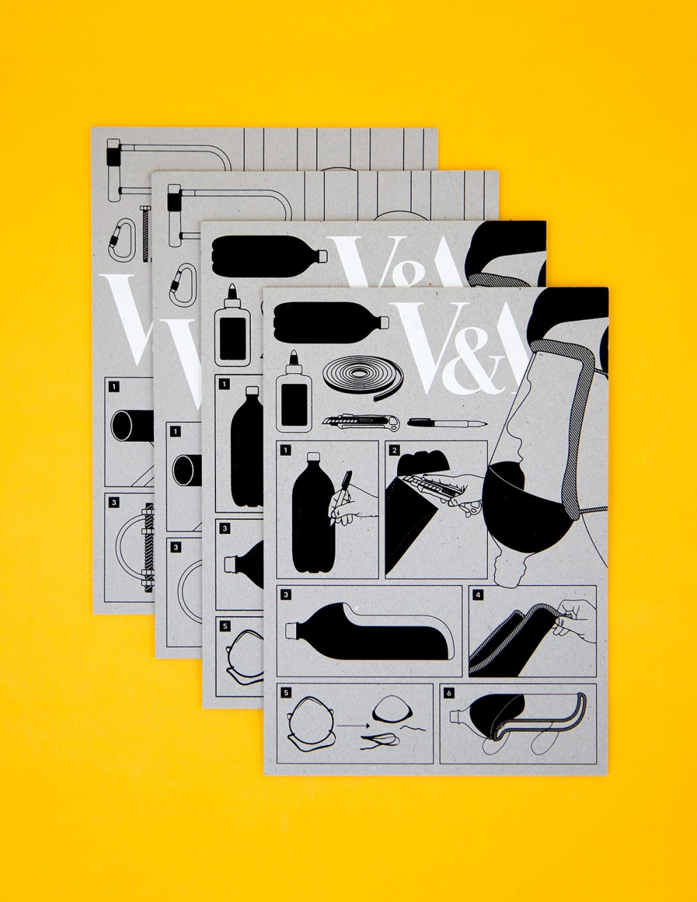
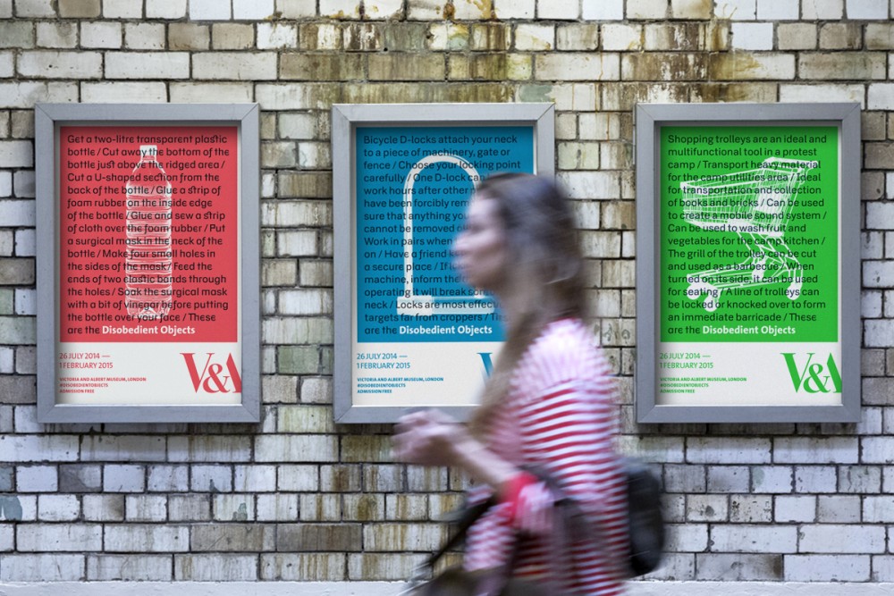
The identity is centred around the transformation of everyday objects into weapons of social change. Rather than placing the focus on the exhibition title, a call for social action takes centre stage: a silhouette of an ordinary object, superimposed with directions on how to transform it into an object for political activism.
The design uses the VirusFonts typeface Doctrine – itself a political critique of the North Korea dictatorship. Doctrine’s alternate character set provided a second voice in which to speak the words of activist, artist and maker, a voice which speaks alongside the more conventional museum narrative.
The utilitarian aesthetic of the user manual finds its way into a series of how-to guides – illustrated instructions to make objects featured in the exhibition. These guides were applied to the invitations and are available as well as tear-off sheets in the exhibition itself.
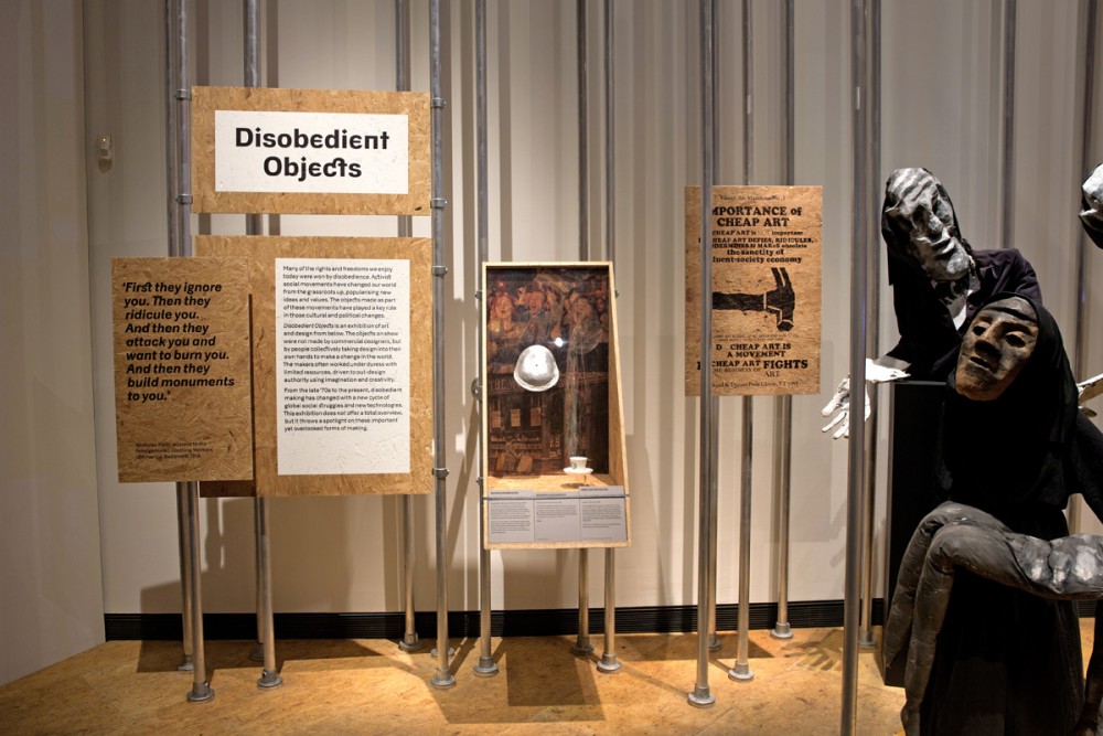
The title of the exhibition at the entrance was created from cable-ties affixed to an upside down crowd-control fence hung at the entrance of the gallery space. A large-scale representation of the history of barricades dominates the doors of the Porter Gallery. Each individual panel features one particular moment, from the French Revolution to the latest barricades seen in the Arab Spring and Ukraine.
Each section panel is printed on a unique material all of which are cheap, mundane and most-importantly used in the making of the objects on show: fabric, stainless steel, cardboard, plastic, tarpaulin and OSB board.
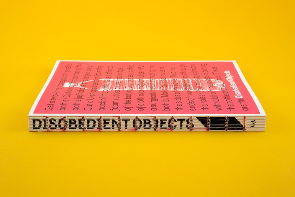
For the catalogue, each essay opens with a list of (disobedient) objects that are subject to the same call to arms as the book cover and posters. The same objects are underlined throughout the book, offering an alternative reading of the texts. Disobedient quotes also crudely interrupted the text.


